Home Decorating Tips

Home Decorating Tips
The Guide to 2024’s Super Chic Neutral Color Combinations
Posted on April 18, 2024
Last updated May 27, 2025
The time has come to redefine your understanding of the neutral color palette. If you’ve ever thought plain colors were uninspiring, let 2024 prove you wrong.
Create a statement that transcends bold and bright trends. Here are some captivating neutral combinations to infuse your space with understated elegance and undeniable style.
A Duo That Makes Rooms Pop
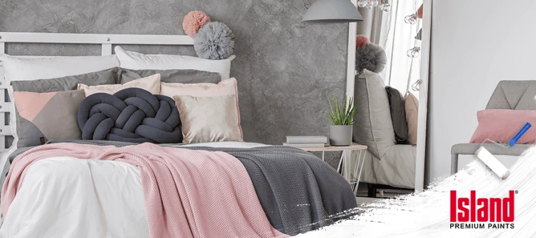
Brighten up your small spaces with the dynamic combination of mustard yellow and gray. This color duo is especially effective in rooms that lack natural light. Yellow, with its bright and cheerful disposition, adds a pop of energy, while gray provides a calm and neutral backdrop. Together, they strike a perfect balance, creating a dynamic and visually appealing contrast.
In interior design, this color combo can be applied in various ways. For a subtle approach, incorporate gray as the dominant color and use yellow as an accent through throw pillows, artwork, or decorative elements. This creates a modern and understated look with a hint of liveliness. Conversely, you can make a bold statement by making yellow the focal point and surrounding it with shades of gray. This approach is particularly effective in areas where you want to infuse energy and warmth, such as kitchens or living rooms.
A Touch of Brown
The beauty of a brown-neutral palette lies in its ability to serve as a foundation for both classic and modern aesthetics. Lighter shades invoke a sense of airiness and openness, making them ideal for smaller spaces, while darker browns exude a rich, luxurious feel, perfect for creating a cozy and intimate atmosphere in larger rooms.
Enhance the tactile (designed to be perceived by touch) experience by incorporating textures like wood, leather, or woven fabrics into your decor. This not only adds depth to the design but also amplifies the earthy charm that defines the brown-neutral palette. Whether you opt for a monochromatic look or blend brown hues with other neutrals, the result is a harmonious and inviting living environment that feels both familiar and sophisticated.
One Shade is All You Need
A monochromatic neutral color scheme revolves around using various shades and tones of a single color to create a harmonious and cohesive look. In the context of neutrals, this typically involves exploring different shades of whites, grays, tans, or beiges. The beauty of a monochromatic neutral palette lies in its ability to deliver a serene aesthetic while allowing for diverse textures and patterns to take center stage.
For example, you might choose varying shades of gray, from light silvers to deep charcoal, for a monochromatic gray scheme. This creates a layered and nuanced appearance that brings depth to your space without the need for contrasting colors.
The key to successfully implementing a monochromatic neutral scheme is playing with subtle variations in the chosen neutral color. Incorporating elements like different finishes and varying tones ensures that the overall design remains visually interesting and avoids monotony.
Whether you opt for a calming all-white palette or a warm spectrum of beige and taupe, a monochromatic neutral approach offers a timeless and elegant foundation for your interior design, allowing other design elements to shine.
Green for a Nature-Inspired Look
Earthy green hues can range from soft sage and olive to deeper forest and mossy greens. This versatile palette pairs well with various neutral tones, such as beige, brown, and cream, allowing for seamless integration into different design schemes. Incorporating earthy green into your living space can be achieved through wall colors, furniture, textiles, and decor items.
This natural and timeless color palette is not only aesthetically pleasing but also brings a touch of the outdoors inside, creating a harmonious and relaxing environment. Whether you’re aiming for a rustic, bohemian, or modern look, earthy green serves as a versatile and soothing choice for interior design.
A Color Set for the Thinkers
Lavender can be a delightful choice for creating a serene reading and dining nook. This gentle and calming shade adds a touch of tranquility to your space, making it an ideal color for areas where relaxation and enjoyment are needed.
For a reading nook, consider painting the walls or incorporating lavender-hued furniture to create a peaceful ambiance. Pair it with plush cushions, throws, and soft lighting to create a cozy retreat for getting lost in your favorite book.
In the dining area, you can use it on the walls, incorporate it into your table setting with lavender-toned tablecloths or napkins, or introduce it through subtle decor accents. This creates a calming backdrop for enjoying meals and engaging in leisurely conversations.
Combine lavender with neutral tones like whites, grays, or soft creams to maintain a balanced and harmonious look.
Different Shades of White and Cream
Combining various shades of cream and white in a space can add depth and interest without sacrificing the overall sense of brightness. Mixing warm and cool tones creates a harmonious and balanced look, contributing to a sophisticated and timeless aesthetic in your interior design. Whether you’re aiming for a classic, modern, or eclectic style, the subtle differences in cream and white shades offer a versatile palette to express your unique taste.
Cream, the warmer counterpart, can range from soft, almost ivory tones to richer, warmer hues with hints of yellow or beige. This variety makes it an excellent choice for creating a cozy and inviting atmosphere in a room.
White, on the other hand, presents a crisp and clean canvas with undertones that can lean towards cool blues, warm yellows, or neutral grays. From pure, bright whites to soft off-white tones, the range of white shades is extensive, allowing for versatility in design.
Go All Out with Limestones and Metals
Are you running out of neutral color ideas for your living room? Consider revitalizing the space by incorporating the subtle charm of limestone and the sleek sophistication of metal tones. Limestone’s earthy and warm appeal can serve as a versatile focal point, infusing a sense of natural appeal into the room.
Use limestone as a primary wall color or in key furniture pieces. Complement this with metallic accents, such as brass, copper, or silver, to introduce a touch of modern flair. Metal finishes add a contemporary edge and reflective quality, elevating the overall aesthetic of the room.
Experiment with integrating these neutral tones alongside timeless hues such as soft creams, muted grays, or warm beiges to enhance the vibrancy of the colors.
A Place for Homeowners and DIYers
If you’re contemplating a new project, here’s a crucial second question to consider: Where should you go on your shopping spree? Island Paints can be your go-to place for a timeless array of neutral paint colors that never go out of style.
With a palette carefully curated to withstand fleeting trends, it is your reliable partner in creating spaces that exude both elegance and longevity. Island Paints invites you to check out their website for neutral palette ideas and great products.
References:
https://www.fabricsandpapers.com/blog/grey-colour-schemes
https://www.bhg.com/rooms/living-room/makeovers/neutral-color/
Related Articles
Family-Friendly Home Designs & Ideas
Let’s face it: when you’re a young family with a couple of rowdy kids running around the house, it can be quite ...
READ MORE

5 Summer Color Themes for Your Home
Summer is once again at our doorstep, so why not come up with color themes to go with it? It’s the season of ...
READ MORE
Effortlessly Chic Home Decor
The humble abode is never really just humble. It boasts of a design that’s carefully thought of and proudly pulled off, DIY ...
READ MORE
Our Products
Our line of high quality paints and products will give your home or project the vibrancy it needs.
Explore Colors
Ready to explore colorful possibiliies today? View our popular paint colo combination palettes for great color schemes and room design ideas for interior and exteriors.