Home Decorating Tips


Home Decorating Tips
Minimalist Color Palettes for Your Next Paint Project
Posted on June 7, 2020
Last updated May 27, 2025
Source: https://thedigitalartisans.com/minimalist-color-palettes/
Painting any space can be exciting but nonetheless daunting. This holds true especially when you want to test the waters first and you want to be safe with the color palette that best works for you. Committing color blunders is never an option, but this should not stop you from pursuing colors that exude the kind of energy you want for your home. Out there are color combinations that can capture the kind of vibe that you want. The key: start with minimalist color palettes. Subtle, yet on point. Understated but will definitely make a statement. Take a look at the following minimalist paint color inspirations.
Love Lavender
Lavender and mocha. Why not? A hint of gray smoke and ash? Not bad. Not a very common combination but definitely one of the most interesting palettes to try. Lavender gives off a feeling of luxury with subtlety. Ideal for that right mix of being creative and quietly luxurious.

Cafe Passion
Rust is never a rusty color at all, as this hue is the star of this energetic color combo. An orange undertone plus mocha or brown gives off a perky ambience, pretty much like what coffee does. The warmth and inviting character of this palette is perfect for dining and work spaces.

Oceania
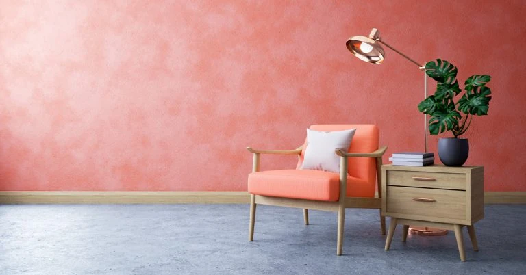
This palette subtly captures the inviting colors of a seaside. Corals and blush that give a hint of the sand and navy blue that mirrors the azure seas are perfect for a patio or a veranda repaint.

Al Fresco
As the label itself says, this palette takes inspiration from the bright, inviting feels of the outdoors. A combination of muted sepia, sage, and ivory creates a backdrop that gives a hint of the great landscape and nature’s energetic but calming wonders.

Canopy
This is a popular combo for creatives, as it evokes freshness and a soothing rush of calmness. Deep forest green, light gray, matcha, and sand simulates the great outdoors lined with canopy of trees. Fresh and blooming, it’s a gentle treat for the eyes.

Blue Gray
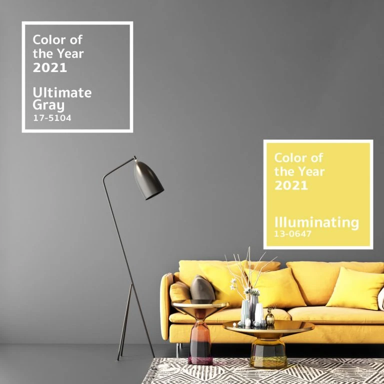
Going minimalist? Know that you will never go wrong with gray. Try ash gray or charcoal gray as your main color with denim or dusty blue as your accent. Cashmere can also be an option. Modern, calming, and very authoritative, this combination is often used by designers.

Gray Blush
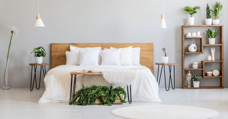
Gray doesn’t necessarily have to be dark and bleak. Pair an ash gray with a touch of pink blush and you have something modern, clean and feminine. Not too girly, not too heavy either. Dust and off white also complement this combo.

Soft Nudes
Romantic and sleek, this palette ushers in a modern vibe without going overboard. Combining blush and warm tones, this exudes femininity and elegance. Pink blush, nude, off white, and ivory make an interesting statement.

Island Premium Paints gives you a wheel of color possibilities with minimalist color palettes that you can experiment on. Roofkote is designed to stand the Philippine weather to give you the kind of protection you deserve. For your repainting project, check out Island Premium Paints. Visit www.islandpaints.com
Our Products
Our line of high quality paints and products will give your home or project the vibrancy it needs.
Explore Colors
Ready to explore colorful possibiliies today? View our popular paint colo combination palettes for great color schemes and room design ideas for interior and exteriors.


